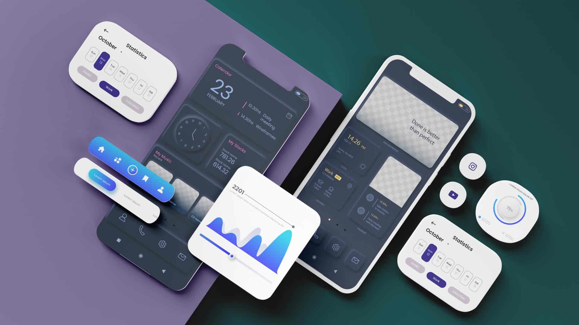
Neumorphic design is a visual trend that has gained traction with UI/UX designers and became a popular aesthetic choice for contemporary software, websites and mobile applications. Drawing on aspects of photorealism and 3D design, neumorphism brought simulated physical attributes, such as textures and shadows, to digital interfaces. To fully appreciate the impact of neumorphic design, we need to take a look into its origins.
The Origins of Neumorphic Design
When Apple first released the Macintosh in 1984, it was the first personal computer with a graphical user interface. At the time, Apple co-founder, Steve Jobs, believed that familiar icons and symbols would help first-time computer users better understand how to navigate the Macintosh interface. Jobs left Apple in 1985, however upon his return in 1997, he steered the company’s UI aesthetic toward skeuomorphism, a style in which interface components mirror their real-world counterparts down to the last detail. By the time Mac OS X was launched in 2001, Apple had developed a full-fledged skeuomorphic system called Aqua – a water-themed design language with glistening icons, buttons, and drop-down menus.
With the introduction of the iPhone in 2007, Apple’s rand of skeuomorphism grew even more lifelike. By the early 2010s, skeuomorphic design was the facto choice for digital interfaces. But as the world became more reliant on mobile devices, skeuomorphism limits became clear; creating skeuomorphic design components is time intensive and requires an excessive degree of technical ability. While skeuomorphic components look fantastic on desktops and home screens, their finer details tend to get lost when scaled to smaller screen sizes.
Standing in a stark contrast to skeuomorphism’s realistic gradients and textures, the mid 2010s saw a widespread adoption of flat design, a digital-era reboot of 1960s minimalism. Flat design stripped interface components of everything except their most essential elements – line, shape, and colour – making it a fast and highly flexible style that was well suited for large companies looking to systematise their design languages.
For a few years, skeuomorphism was an abomination to designers, but from the ashes, a new trend rose to prominence. Late 2019, neumorphism (short for “new skeuomorphism’) arrived and appeared to offer the best of its predecessors. Striking a balance between hyper realism and minimalism, neumorphism makes use of colours, textures, and shadows in a way that feels true to life without being excessively detailed.
Neumorphism 101
Neumorphic design has three common characteristics:
- Monochromatic colour schemes
- Low contrast and
- Subtle shadows
UI designers are able to easily apply these traits to a wide range of design components that exhibit neumorphism’s soft aesthetic. Let’s have a look at a simple calculator app design to see how neumorphic design works:
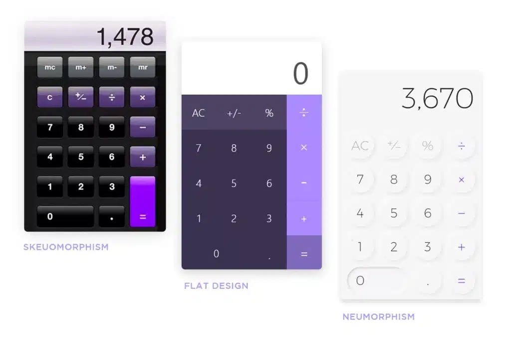
In the first calculator on the right, the skeuomorphism design, the calculator is rendered with gradients and highlights, and the colour palette helps to separate foreground elements from the background. It’s meant to look, and function, like a calculator you might find laying around your office or home. A flat design version of the calculator, the middle design in the example above, abandons skeuomorphism’s representational rendering techniques and relies on shapes and blocks of colour to distinguish its various sections.
In the final example in the image above, Neumorphic design draws from both skeuomorphism and flat design by pairing a monochromatic colour palette with subtle shadows that make the calculator’s buttons appear tactile. The lowered contrast between the foreground and the background gives the calculator a soft finish, and the overall effect is a simplified realism.
Neumorphic Design Examples
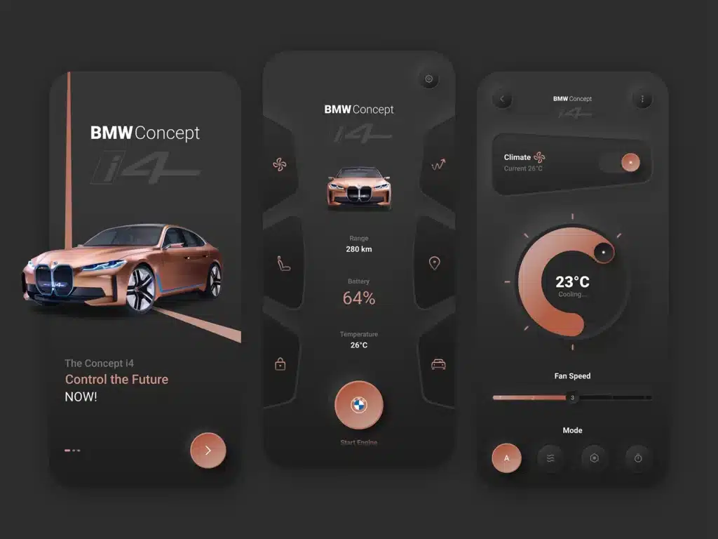
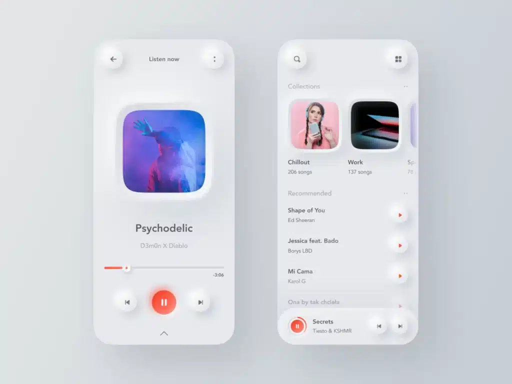
Now that you are aware of Neumorphism’s unique attributes, you will start to notice neumorphism everywhere. Indeed, UI designers in diverse industries such as the automotive, entertainment, healthcare and finance industries have been reimagining interface components with neumorphism’s signature look:
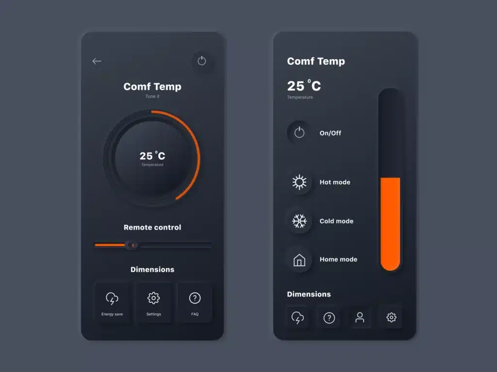
The Pros and Cons of Neumorphic Design
All design trends have benefits and drawbacks. When used thoughtfully, trends are able to breathe new life into predictable design patterns, but difficulties arise when trends are forced into applications where they don’t serve the end user. Let’s explore the pros and cons of neumorphic design to better understand its utility.
Benefits of Neumorphic Design
Because of the visual simplicity of neumorphism, it is an ideal fit for digital products, which often consist of dozens, if not thousands, of screens and design components. In digital product design, simplicity has several advantages: it makes it easier for designers to create aesthetically cohesive experiences – regardless of the amount of screens a product may have. It accelerates the process of conceptualising, building, testing, and iterating new screens. And it helps designers keep products visually consistent as they evolve.
In addition to the simplicity, neumorphism’s realistic qualities can make UI components appear more tactile and may help signify interactivity to the end user.
Drawbacks of Neumorphic Design
While neumorphism is a popular and widely used trend, it does come with accessibility concerns. If designers opts to make use of neumorphic design elements that are strictly monochromatic, they could create problems for people with visual impairments such as colour blindness. Additionally, neumorphism’s reliance on low contrast to achieve the soft look can hinder readability and make it difficult for users to identify buttons, icons, forms and other important interface features.
Neumorphic Design Is Timeless
When neumorphic design is implemented with the user’s needs (and accessibility) in mind, neumorphism is a visually compelling UI design option for apps and websites. Its understated shadows and soft textures give UI components a warmth that invites interaction. In the design world, styles can come and go, but the simplicity of neumorphism and its tactile qualities make it well suited to stand the test of time.
