It’s the colours, stupid! (Part 3)

In the first part of this blog series, we explained how the color wheel works, based on 12 main colors and the different colour hues, tints, tones and shades. For those who missed this blog, see https://m2-d2.com/en/its-the-colours-stupid-part-1/. In part two of this blog series, we discussed seven common color schemes,. Including some pros and cons […]
It’s the colours, stupid! (Part 2)

In the previous part of this blog series, we explained how the colour wheel works, based on 12 main colours and the different colour hues, tints, tones and shades. For those who missed this blog, see https://m2-d2.com/en/its-the-colours-stupid-part-1/. In this blog we will elaborate on seven common colour schemes. When selecting colours for a colour scheme, […]
It’s the colours, stupid! (Part 1)

One of the most powerful tools available to graphic designers: colour! Colour is an essential component that can set the tone, convey emotions, and even affect the viewer’s behaviour. The study of colour theory helps creative artists across different callings make informed choices about using colour effectively: in websites, packaging, logos, prints and interiors. In […]
UI Animations

UI animations have come a long way over the last decade. Animations don’t just look awesome, but they have evolved into a universal digital language that end users recognise and understand. These micro-interactions allow designers to communicate with users through movements and animation to provide the user with guidance, context, and an immersive user experience. […]
An Overview of Neumorphism

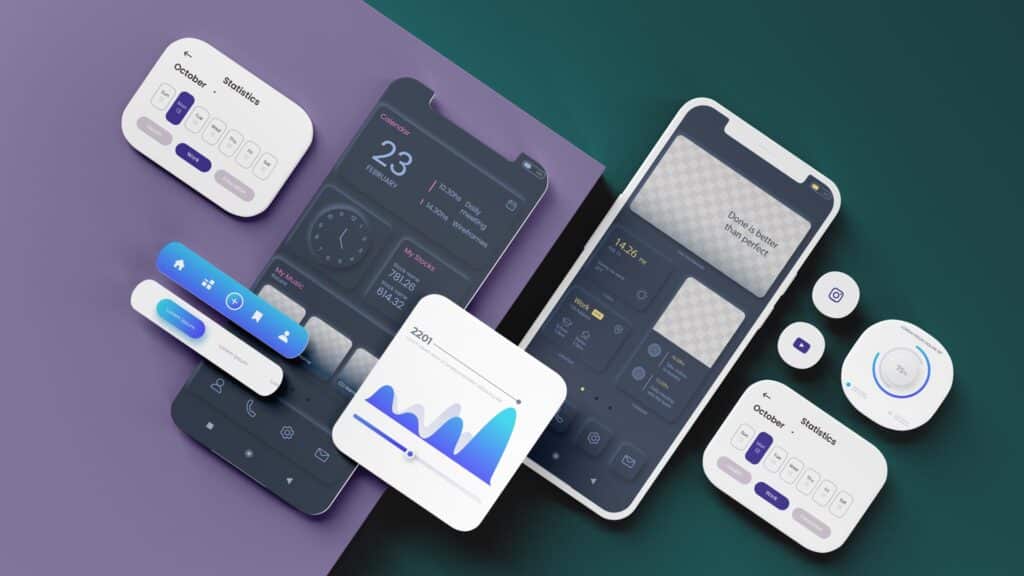
Neumorphic design is a visual trend that has gained traction with UI/UX designers and became a popular aesthetic choice for contemporary software, websites and mobile applications. Drawing on aspects of photorealism and 3D design, neumorphism brought simulated physical attributes, such as textures and shadows, to digital interfaces. To fully appreciate the impact of neumorphic design, […]
Dark UI Design

Dark UI Design: to Do, or to Don’t? Implementing dark backgrounds and patterns in web-, mobile-, and software applications continues to gain traction. So, when asked whether a light-based user interface, or a darker one is better, there simply is no straightforward answer. There are however several considerations that can help you make the right […]