
In the previous part of this blog series, we explained how the colour wheel works, based on 12 main colours and the different colour hues, tints, tones and shades. For those who missed this blog, see https://m2-d2.com/en/its-the-colours-stupid-part-1/. In this blog we will elaborate on seven common colour schemes.
When selecting colours for a colour scheme, the colour wheel gives you opportunities to create brighter, lighter, softer, and darker colours by mixing white, black and grey with the original colours.
While it is possible to create your website using a combination of every colour of the rainbow, chances are the final product won’t look great. Thankfully, colour experts and designers have identified seven common colour schemes to help jumpstart your creative process. The types of colour schemes include:
- Monochromatic
- Analogous
- Complementary
- Split complementary
- Triadic
- Square
- Rectangle
Let’s examine each type of colour scheme in more detail.
1. Monochromatic
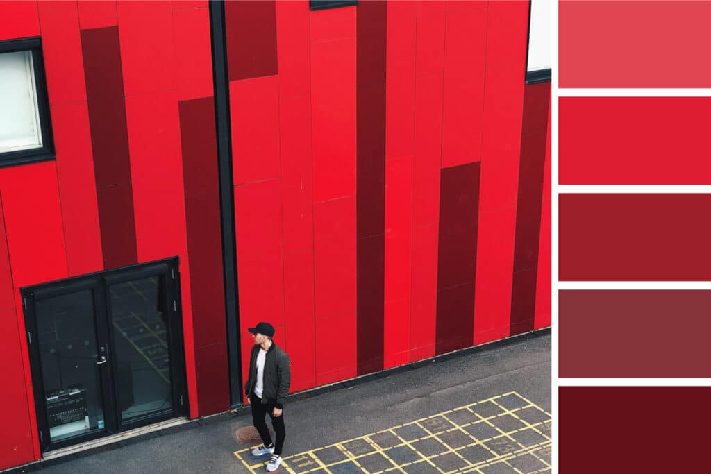
Monochromatic colour schemes make use of a single colour with varying shades and tints to produce a consistent look and feel. Although monochromatic colour schemes lack colour contrast, it often ends up looking clean and polished. It also allows easy amendments to the darkness and lightness of the colours.
Monochromatic colour schemes are often used for graphs and charts where high contrast is not necessary. Below is an example of the monochromatic colours that fall under the red hue (a primary colour):
2. Analogous
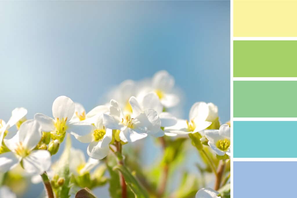
Analogous colour schemes are formed by pairing one main colour with the two colours directly next to it on the colour wheel. You can also add two additional colours (which are found next to the two outside colours) if you want to use a five-colour scheme instead of just three colours.
Analogous structures do not create themes with high contrasting colours, so they are typically used to create a softer, less contrasting design, for example, you could use an analogous colour structure to create a colour palette with a spring theme. This scheme is great for creating warmer or cooler colour palettes like the one seen below.
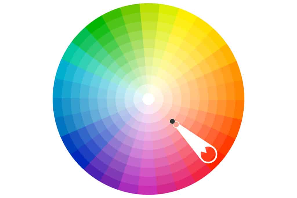
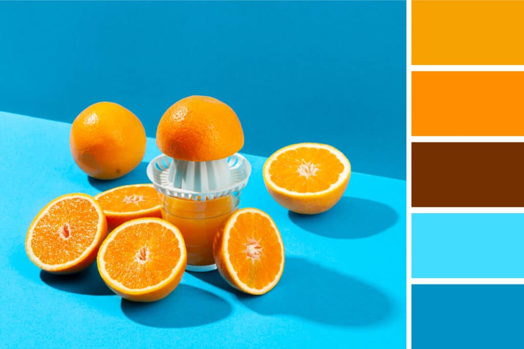
3. Complementary
As you may have guessed, a complementary colour scheme is based on the use of two colours directly across from each other on the colour wheel and relevant tints of those colours.
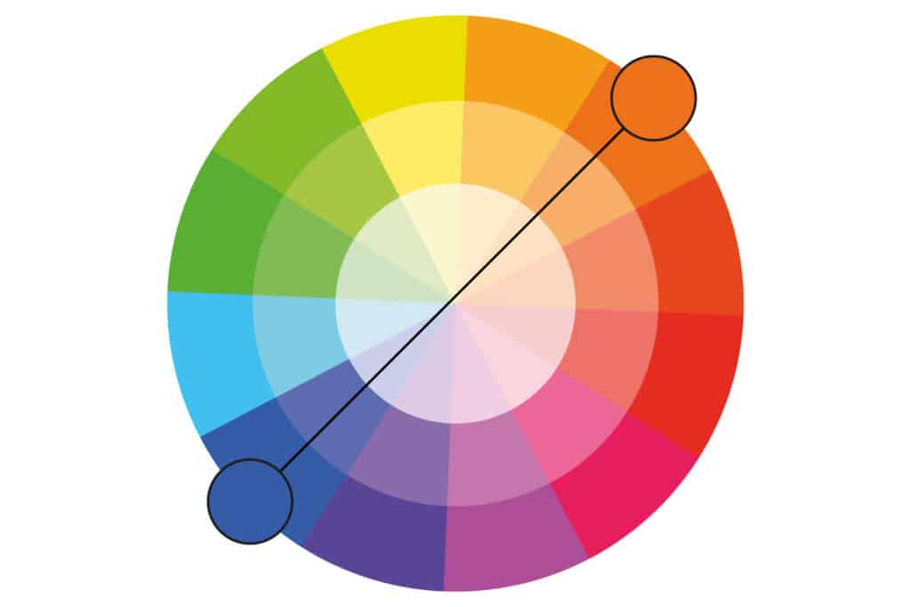
The complementary colour scheme provides the greatest amount of colour contrast. Because of this, you should be careful about how you use the colours in a scheme. It is best to use one colour predominantly, and use the second colour as accents in your design. Complementary colour schemes are also great for graphs and charts, the high contrast between the colours helps you highlight important points and takeaways.
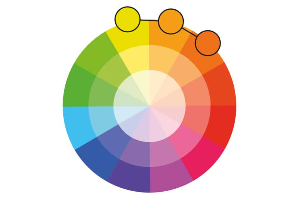
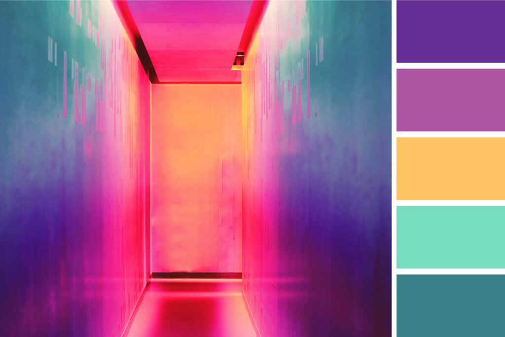
4. Split Complementary
A split complementary colour scheme includes one dominant colour and the two colours directly adjacent to the dominant colour’s complement. This creates a more nuanced colour palette than a complementary scheme while still retaining the benefits of contrasting colours.
Split complementary colour schemes can be difficult to balance, because unlike analogous or monochromatic schemes, the colours used all provide contrast (similar to complementary schemes).
The pro and con aspect of the split complementary colour model is that you can use any two colours in the scheme and get great contrast… but it also means it can be tricky to find the right balance between the colours. As a result, you may end up playing around with this one a bit more to find the right combination of contrast.
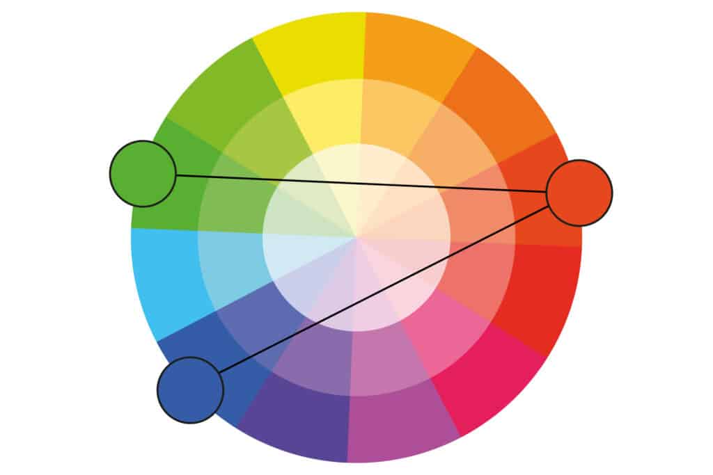
5. Triadic
Triadic colour schemes offer high contrasting colours while retaining the same tone. Triadic schemes are created by choosing three colours that are equally placed in lines around the colour wheel.
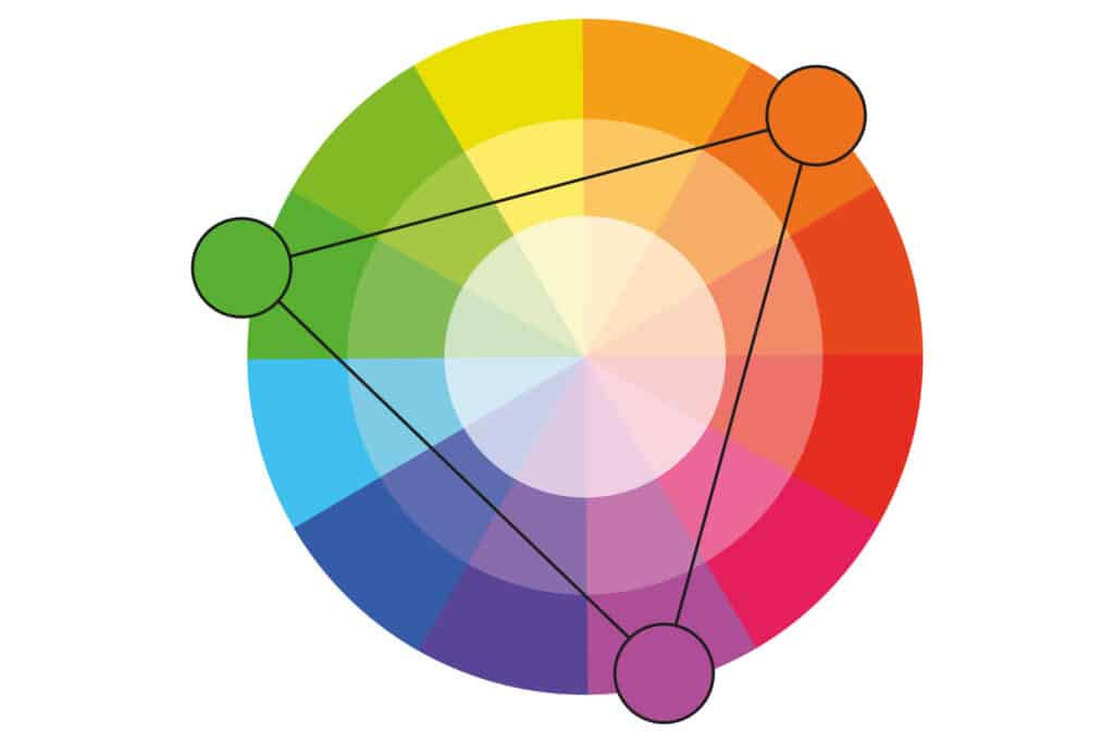
Triad colour schemes are useful for creating high contrast between each colour in a design, but they can seem overpowering if all of the colours are chosen on the same point in a line around the colour wheel.
To soften some of the colours in the triadic scheme you can select a single dominant colour and use the other colours sparingly, or simply tone down the other two colours by simply selecting a softer tint.
The triadic colour scheme works excellent in graphics like bar- or pie charts as it offers the contrast you need to create your comparisons.
6. Square
Square colour schemes makes use of four colours that are equidistant from each other on the colour wheel to create a square or diamond shape. While this evenly-spaced colour scheme offers substantial colour contrast to your design, it is a good idea to select a single dominant colour rather than trying to balance all four.
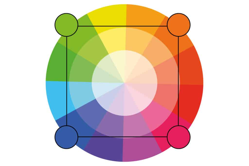
Square colour schemes are great for creating interest across your web designs. Not sure where to begin? Pick your favourite colour and simply work from there to investigate whether this scheme suits your brand or website. It is also a great idea to try square schemes against both black and white backgrounds to find the best suitable fit.

7. Rectangle (Tetradic)
Known as the tetradic colour scheme, the rectangle approach is similar to the square colour scheme but offers a more subtle approach to colour selection.
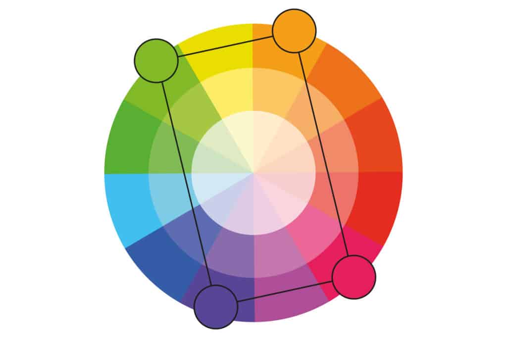
A rectangular scheme is the richest of all available colour schemes. This scheme offers you the most variety when working with colour. It opens some fun and creative options for you, but it is also challenging to pull off correctly. Without the right proportions the result can be disastrous.
Okay, seven colour schemes then. And how are you going to choose which one to apply? We will get into that in the third and final part of this blog series.
