
One of the most powerful tools available to graphic designers: colour! Colour is an essential component that can set the tone, convey emotions, and even affect the viewer’s behaviour. The study of colour theory helps creative artists across different callings make informed choices about using colour effectively: in websites, packaging, logos, prints and interiors. In this blogpost, we are going to explore why colour theory is a critical component in graphic design and provide a couple of examples of how colour theory is used to create visually appealing and effective designs. Mastering colour theory as a skill may become your secret weapon. However, nothing stops you from using ready-made colour combinations before you start producing custom colour schemes.
Understanding colour theory
Colour theory is the basis for the primary rules and guidelines that surround colour and its use in aesthetically pleasing visuals. By understanding colour theory basics, you can begin to parse the logical structure of colour for yourself to create and use colour palettes more strategically. The result means evoking a particular emotion, vibe or aesthetic. Colour theory is about understanding how colours work together to create a unified visual experience. It is also about knowing which colours complement each other and which clash.
Colour theory basics
Let’s first go back to high school art class to discuss the basics of colour. Remember hearing about primary, secondary and tertiary colours? They are pretty important if you want to understand, well, everything about colour.
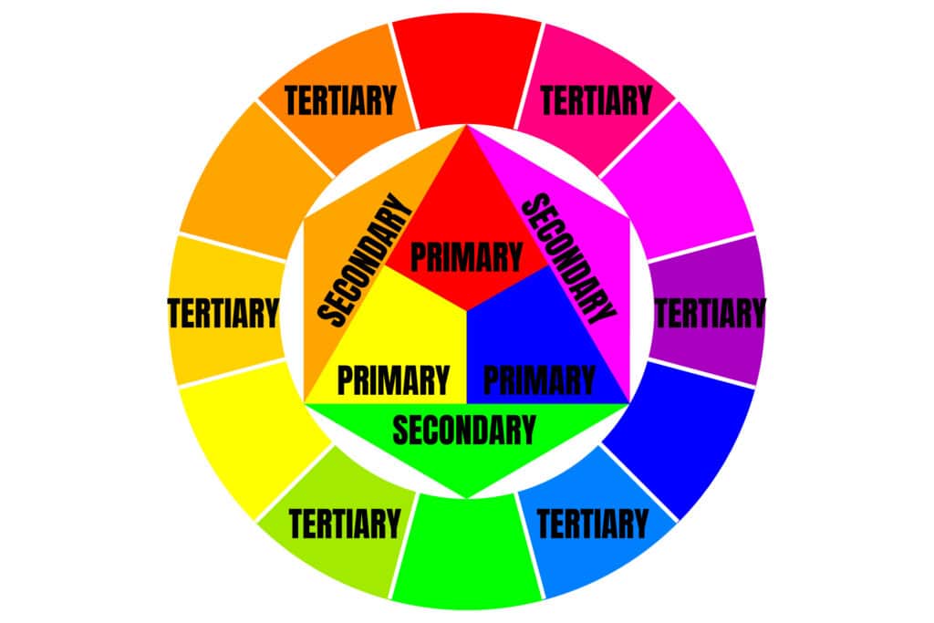
What are primary colours?
Primary colours are those you cannot recreate by combining two or more other colours together. There are three primary colours:
- Red
- Yellow
- Blue
Think of primary colours as your parent colours. Anchoring your design in a general colour scheme. Any one or combination of these colours can give your brand guardrails when you move to explore other shades, tones and tints.
What are secondary colours?
Secondary colours are the colours that are created by combining any two of the three primary colours listed above. There are three secondary colours: orange, purple, and green. You can create each one using two of the three primary colours. Here are the general rules of secondary colour creation:
- Red + yellow = orange
- Blue + red = purple
- Yellow + blue = green
Keep in mind that the colour mixtures above only work if you use the purest form of each primary colour. This pure form is known as a colour’s hue, and you will see how these hues compare to the variants underneath each colour in the colour wheel below.
What are tertiary colours?
Tertiary colours are created when you mix a primary colour with a secondary colour. From here, colour gets a bit more complicated, and if you want to learn how the creative artists choose colour in their designs, you have to first understand all the other components of colour.
The most important component of a tertiary colour is that not every primary colour can match with a secondary colour to create a tertiary colour. For example, red cannot mix in harmony with green, and blue cannot mix in harmony with orange – both of these mixtures would result in a slightly brown colour (unless of course that is what you are looking for). Instead, tertiary colours are created when a primary colour mixes with a secondary colour that comes next to it on the colour wheel below. There are six tertiary colours that fit this requirement:
- Red + purple = red-purple (magenta)
- Red + orange = red-orange (vermillion)
- Blue + purple = blue-purple (violet)
- Blue + green = blue-green (teal)
- Yellow + orange = yellow-orange (amber)
- Yellow + green = yellow-green (chartreuse)
Designers and creatives make use of a colour wheel to pick the best and most compatible colours to ensure the combinations achieve the desired visual effect. And these are only the basics from which real creativity begins.
The colour wheel
So now we know the “main” colours, but well know that choosing colour combinations, especially on a computer, involves a much wider range than 12 basic colours. This is the power behind the colour wheel, a circle graph that charts each primary, secondary, and tertiary colour – as well as their respective hues, tints, tones, and shades. Visualising colours in this way helps you choose colour schemes by showing you how each colour relates to the colour that comes next to it on a rainbow colour scale.
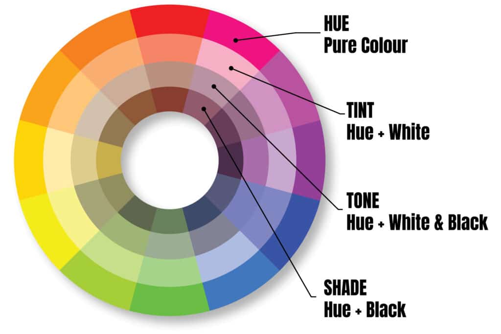
When selecting colours for a colour scheme, the colour wheel gives you opportunities to create brighter, lighter, softer, and darker colours by mixing white, black and grey with the original colours.
While it is possible to create your website using a combination of every colour of the rainbow, chances are the final product won’t look great. Thankfully, colour experts and designers have identified seven common colour schemes to help jumpstart your creative process.
In Part 2 of this blog series, we will delve further into those color schemes.
